Growth Experiments
To: Rock Content
Year: 2023
- A/B Testing
- Growth Marketing
- CRO
- UX Design
During my time on Rock Content’s marketing team, I experienced growth logic up close: test, measure, and learn quickly. I participated in several experiments to optimize website pages, increase conversions on landing pages, and improve social media performance. Each hypothesis was an opportunity to learn from real data rather than making decisions based on intuition.
From the many tests conducted, I selected two that brought unexpected insights:
- Test #1: comparison between static vs. animated banners
- Test #2: evaluation of rich content landing page redesigns
Test #1: Blog Banner Tests
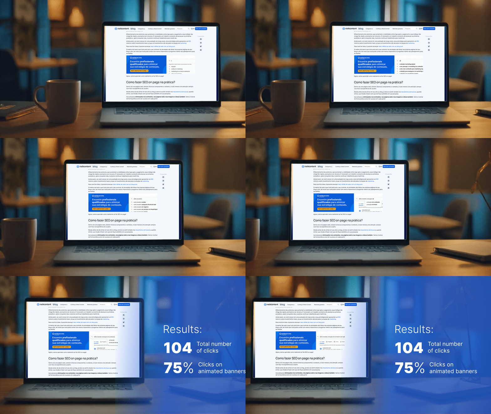
The goal of this test was to understand what would generate more clicks on blog banners: static or animated. The experiment was conducted on Rock Content’s Portuguese blog, which receives thousands of daily visits and is the company’s main showcase in Brazil.
I led the project by defining the strategy, creating the banners, and selecting the measurement platform. The content team supported by selecting the blog posts with the highest monthly visits, and the Growth Specialist assisted me in analyzing the data. Test stages:

1. Information gathering:
With the help of the content team and Google Analytics, I mapped which blog posts had the highest monthly traffic.
I selected 100 posts for testing. To standardize the analysis and reduce variables, I used two banner models promoting the same content. I designed both static versions (control) and animated (GIF) versions using Illustrator and Photoshop. The A/B test distributed traffic equally between both versions.
After 30 days, model 01 had 34 clicks (61% animated, 39% static), and model 02 had 27 clicks (81% animated, 19% static).
Test #2: A/B Testing: Landing Page
In January 2024, I conducted an A/B test with one of Rock Content’s rich content landing pages to evaluate which layout would generate more conversions. The goal was to optimize lead capture performance before updating all older pages.
The project involved creating two versions of the landing page in HubSpot for the material “Kit – Escale a sua Produção de Conteúdo”:
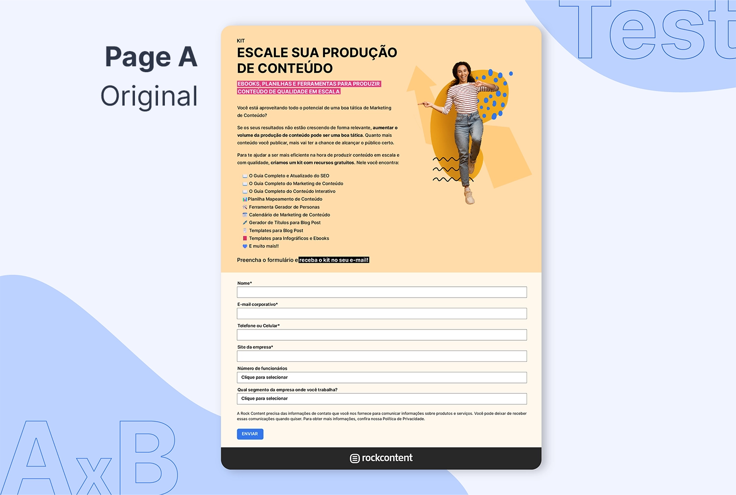
Layout A (Original):
Form at the bottom of the page
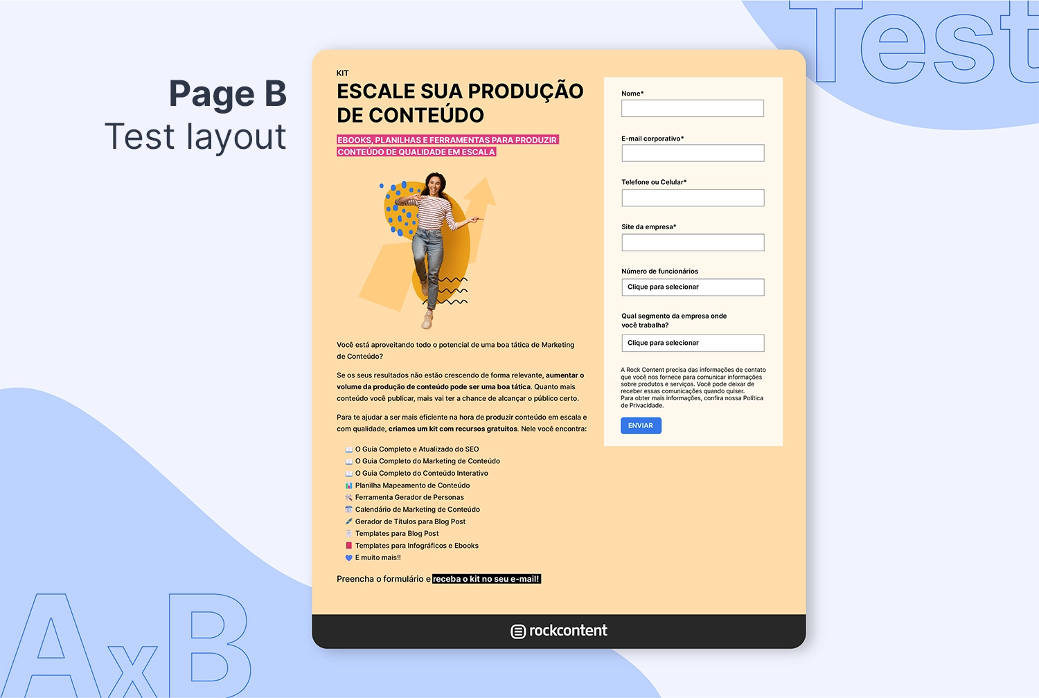
Layout B (New):
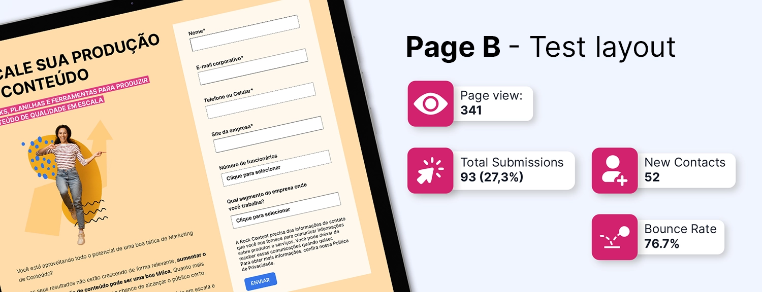
Two-column layout with the form on the right.
There was an internal expectation that a two-column layout — more commonly found on other companies’ pages — would increase conversions since users would encounter a format they were already familiar with.
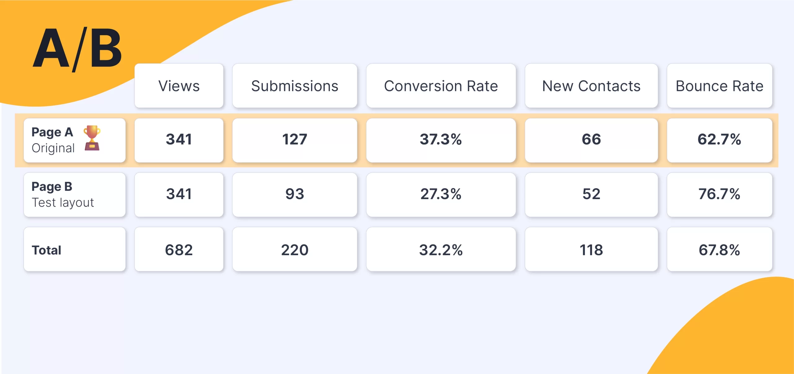
Traffic was evenly split between the versions, resulting in 682 total views and 220 submissions, with 95% statistical significance.
Results:
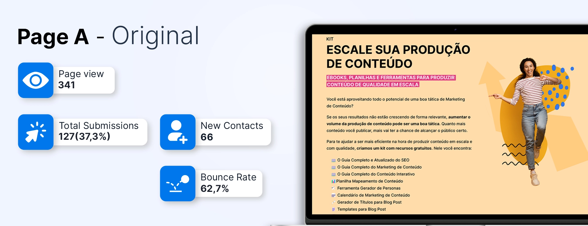
Layout A (Original):
341 views, 127 submissions, 37.3% conversion
Layout B (New):
341 views, 93 submissions, 27.3% conversion
The test showed that the original layout had 10% more conversions. With this insight, I decided to replicate the test on three other older, high-traffic landing pages to confirm the results.