When I joined Athennian in August 2024, I noticed that the existing color palette, although functional, did not provide the visual consistency needed across marketing and product. The brand’s main color — blue — was paired with two analogous tones, plus yellow and red as complementary colors. While vibrant, these combinations created challenges: “ad-hoc variations” often broke visual consistency.
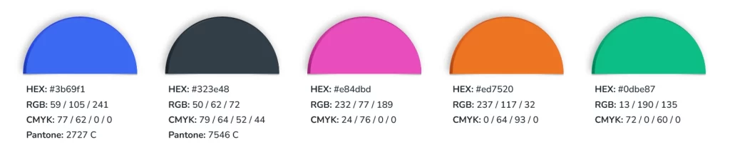
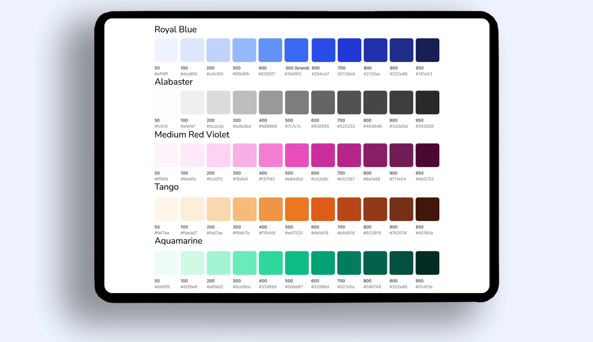
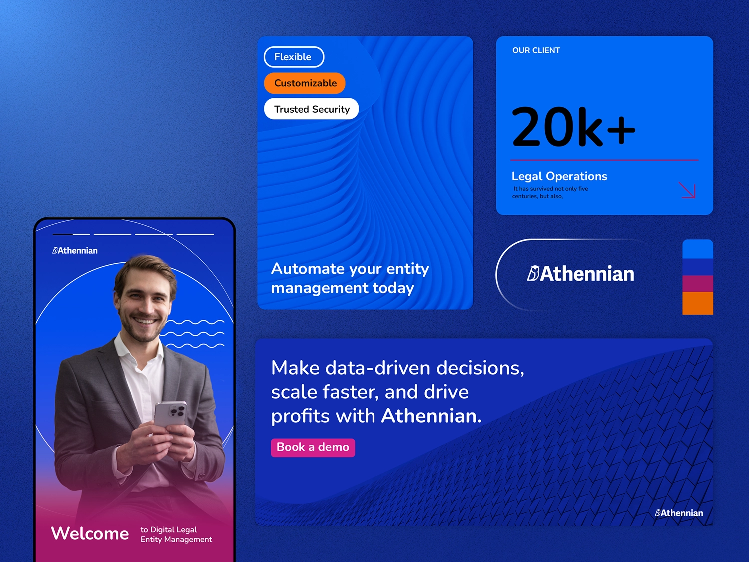
As the sole designer in the first stage of the project, I developed a new color palette with five tonal variations — from the darkest shade, for impact and elegance, to the most vibrant, for highlighting key elements. Blue remained the protagonist, while red and light blue were replaced with complementary (orange and yellow) and analogous (green and pink) tones that worked better with the brand’s main color.
The project had two main goals:
- Unify color usage across marketing and product;
- Increase accessibility and make standardization easier for all teams.
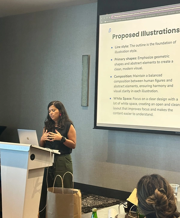
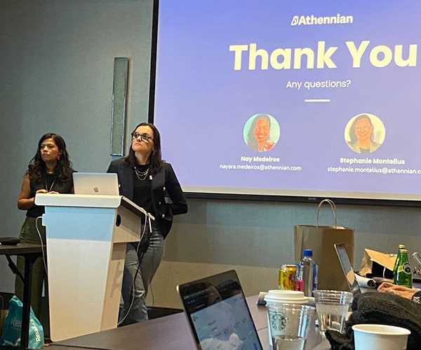
In December 2024, I presented the proposal to the Marketing leadership team, who requested only minor adjustments. In January 2025, during the Revenue Summit in Fort Lauderdale (FL), I officially presented the new palette to the Sales, Customer Success, and Marketing teams, receiving very positive feedback.
After the event, I began working weekly with the Product team’s UX/UI Designer, fine-tuning hues and ensuring the new palette could be applied consistently throughout the company.
The result: a more cohesive, modern, and accessible visual identity, ready to reflect Athennian’s evolution and support its growth in the coming years.